8 Tips For Designing Better App Onboarding Screens
Uncategorized
Users’ first impressions of an app are formed by its onboarding screens, which not only set the tone for the remainder of their time with the app but also provide a prime opportunity to explain the app’s value and the benefits that will pique the user’s interest.
Successfully introducing a user to an app requires knowledge of what makes for a good onboarding screen.
What are the onboarding screens?
New users of an app are presented with a series of “onboarding screens,” or sets of instructions and directions, upon first installing and launching the app. These screens provide an overview of the app’s services, and can be used to help users adjust their expectations for what they can accomplish with the app.
An app’s onboarding screens are meant to introduce new users to the app’s benefits and to remind returning users of the app’s significant updates since they last logged in; each onboarding screen is dedicated to a single benefit.
Create onboarding or introductory screens with the following goals in mind:
- First Impressions Matters
The first impression a user forms of the professionalism and quality of service offered by an app is shaped by the design of its onboarding screens and the information it presents there. - Set Expectations
Onboarding screen help users better understand the app by setting realistic expectations for what they can do with it. - Highlight Updates
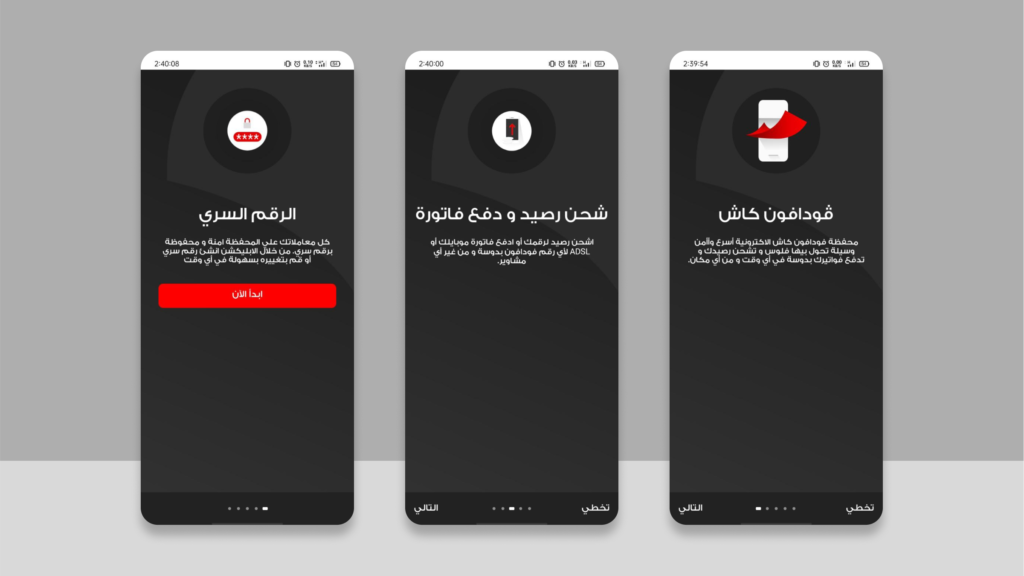
Onboarding screens are not limited to the first time a user launches an app after downloading it from the stores; they can also be used to introduce fresh and new updates or to highlight specific features within the app. For example, you see an onboarding screen when you first open the Vodafone Cash service inside the Ana Vodafone app.
Onboarding Screens Components
There is a core set of components that must be added to every onboarding screen, and other optional features that can be added on terms or left out entirely without negatively impacting the experience of the onboarding process.
These primary components are:
- Description
The description needs to focus on the problem the app solves and the direct value it provides. Don’t make the mistake of describing the app in terms of its features, such as “View the latest offers” or “Get in touch with the vendor.” - Media
By utilizing eye-catching images and illustrations that relates to the content on display, the onboarding screens are more likely to achieve its intended purpose. - “Next” Button
A button that enables the user to go to the next onboarding screen or the registration or login page.
The secondary components are:
- Headline
The description can have a title or headline, but you should avoid using empty headlines like “Direct communication,” “Sell your stuff,” “Technical support,” etc. - Progress Indicator
A counter or other visual cue that indicates how many onboarding pages remain and which step the user is currently viewing. - “Skip” Button
A button that enables the user to skip the onboarding screens completely and enter the app directly or register a new account.
Onboarding Screens Best Practices
Best practices for designing onboarding screens are:
1. Screen Count
There should be no more than three onboarding screens. If the number is higher than that, the content needs to be rewritten. It is recommended to include the progress bar and the Skip button if more than three pages are required.
2. Gestures
Swiping in the opposite direction of the language the onboarding screens are being viewed in is the expected and natural movement. The swipe direction is left to right if the design is written in Arabic and right to left if it’s written in English.
3. Videos and Animations
Make sure that any videos or animations included in the onboarding screens are small in file size and can be played smoothly even on older, less powerful devices.
4. Content
Never forget that it is more important to highlight the app’s value and benefits to the user than it is to list the app’s features and functions.
5. Interactions
Don’t make things more complicated than they need to be by adding a bunch of buttons or CTAs or stacking them on top of each other. Focus on just one.
6. Permits
Do not ask for app permissions (such as camera, storage, or location) until after the onboarding screens. Avoid requesting before or during them.
7. Timing
The first time users use the app or right after an important update is when you should introduce the onboarding screens. Extra onboarding screens for key features are fine, but too many will overwhelm users; in that case, quick guides and explanations are the way to go.
8. Authentication
After the onboarding screens, the authentication process begins. Use the onboarding screens to their full potential by not asking for too much information during registration.
Conclusion
Focusing on the value, which is achieved to the user through the app, linking it directly to the loyalty of the brand and the success of the whole project, is best done in the onboarding screens, which provide a great opportunity to showcase the benefits of the app to users before they even begin using the app.
جاهز لتحويل فكرتك لحقيقة ملموسة وناجحة؟
Search
Search for projects, articles, resources, or tags.
Egyptian governrates emblems and flags (png, svg)
A set of emblems and flags of the different governrates of Egypt. Available for both personal and commercial use and in various formats to fit any kind of workflow and design.
Graphics