Bars — Fully customizable iOS and Android status bars for Figma and Adobe XD
Components and Design SystemsThis Status Bar Component is available for iPhones and iPads, as well as Android phones and tablets, and it offers optimal customizability and adjustability for the status of Wi-Fi, data, Bluetooth, and battery. The purpose behind the Status Bar Component is to allow you to display the different potential states of your design pages on mobile devices. Available for Figma and Adobe XD.
About the Component
In my experience as a Digital Product Designer, whenever I am at the homestretch of designing the pages and various use cases that constitute a given project, a few unforeseen issues always pop up. These issues require careful, undivided attention in order to improve the UX broadly, or to provide for special use cases and scenarios that might only come to light when the user attempts a particular task on the site/app.
There are two types of these special use cases, internal and external. Internal special use cases occur with tasks that users perform within the platform and are dependent on the innumerable data that users input while performing these tasks. There are many examples of internal special use cases, and they vary according to the type of service provided as well as the task that the user interacts with, including credit card expiration, request delivery failure, or even a particular feature being buggy or inaccessible.
On the other hand, external special use cases take place when interacting with device features outside the scope of the platform, such as activating the device’s location, camera, microphone, or data/Wi-Fi connection.
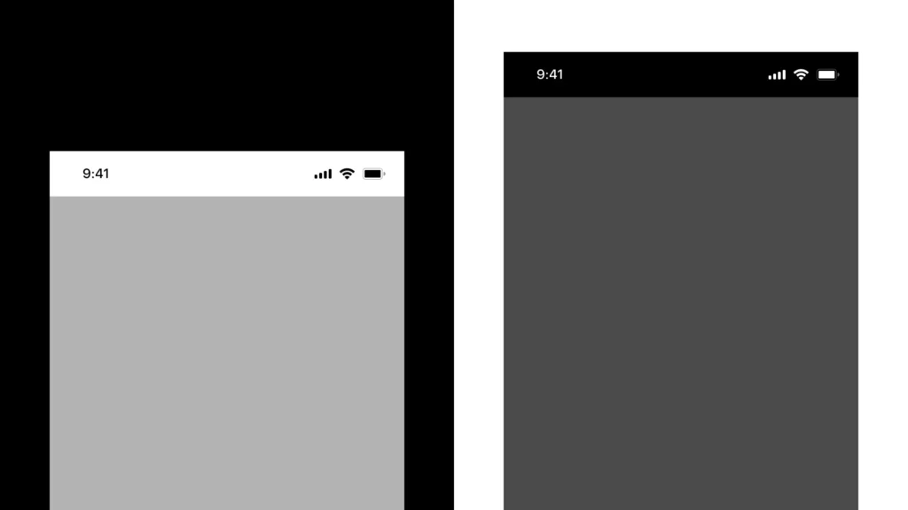
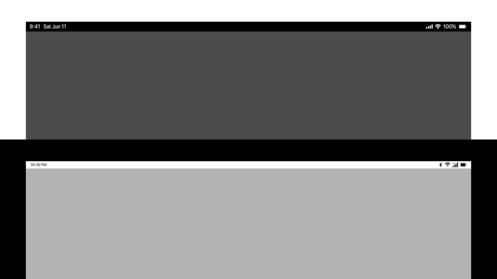
The way UX/UI Designers typically manage external special use cases is through pasting a facade status bar at the top of each page to approximate the final display of how the design will look after all the programming is done. The status bar in this approach is placed without any kind of modification to its state. That spurious bar is sufficient in most design pages, and we usually do not need to modify anything in it, except to align its colors with the rest of the interface design. However, when interacting with an external special use case, it is always better to display the impact of that use case on the status bar in order to make the page design consistent with its reality.
Some of the most frequent examples of external special use cases are:
- Loss of Internet connection.
- Asking for permission to access the device’s location.
- No mobile network coverage.
- Turning on Bluetooth and connecting to another device.
I used to design a status bar for each new project, which required plenty of time. So, I shifted to using pre-made status bars that were available to the public on the Internet or in Figma Community. The problem I faced, though, in utilizing the components of ready-made status bars is that they are all static and inactive. They do not support displaying different status combinations without manually modifying them, which consumes a lot of time that could be alternatively invested in designing the actual interface.
To avoid this issue in the future, I created a status bar component for my periodic and frequent use in all upcoming projects. This component supports quick modification for most of the elements it contains, which allows you to save plenty of time and effort. As a matter of fact, I’ve already been using it for a while now, and it’s been timesaving and fun for me. I have recently shared the component with a fellow designer at work, and she loved it and suggested that I should share it with all the designers in Figma Community, so here I am.
I have recently also modified the component to make it fit with the latest Figma update which allows for Component Properties as well as the updated Auto Layout features for the design layers. This means that now any UX/UI Designer can edit the component with no more than a single click. Moreover, I added status bar designs for Android phones and tablets and created an adjacent component in Adobe XD which includes the same modification capabilities that allow for adjusting the different elements that the bar contains.
Contents
The design files include the following:
- iPhone Status Bar
- Android Status Bar
- iPad Status Bar
- Android Tablet Status Bar
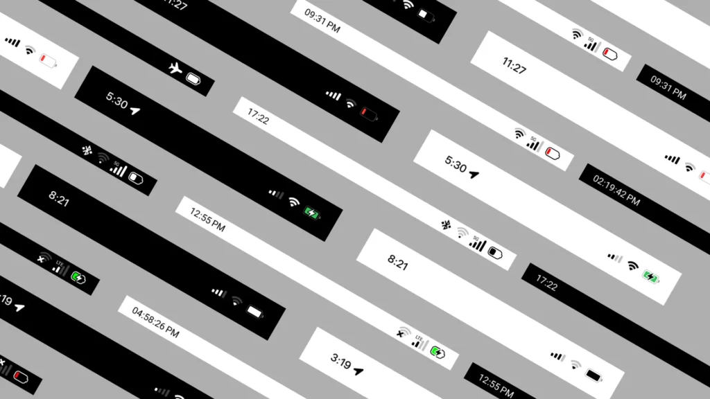
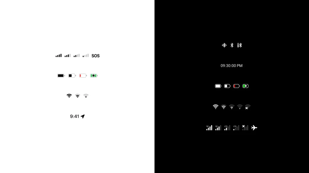
The component supports the following modifications:
- Time and Date.
- Mobile network and data coverage.
- Wi-Fi network connection.
- Bluetooth, and connecting to other devices.
- Battery and its different levels.
- Colors and dark mode.
With this component, you can easily tweak the Wi-Fi status, network coverage, Bluetooth pairing, and/or battery level. You can also display more details to the design in order to make it more vivid and lively, rather than simply pasting the bar into oblivion at the top edge of your pages.
Here are some examples of component usage from my previous works:


Download
The Figma and Adobe XD design files of the Status Bar Component are available to download for free via Gumroad at this link:
You can also get the Figma component from the Figma community via this link:
If you find this component useful on a professional level, don’t forget to share it with other designers in your circles.
Thanks in advance!
Usage Rights
Public Domain: You can use this component in all your personal and commercial works without having to mention the designer’s name, and without having to include a link to the original site.
Search
Search for projects, articles, resources, or tags.
Egyptian governrates emblems and flags (png, svg)
A set of emblems and flags of the different governrates of Egypt. Available for both personal and commercial use and in various formats to fit any kind of workflow and design.
Graphics